ABOUT THE PROJECT
TYPuzzle is a unique system for people to explore, design and animate bitmap letter forms. It is the latest outcome of an ongoing research project by Ian Mitchell questioning the validity of typographic experimentation. In this instance: the potential for a restricted modular system to produce a variety of typographic forms within a consistent typeface; the feasibility for using this modular system to design and produce animated typography or “motion type”; and the use of a haptic design interface to encourage experimentation with typographic forms.
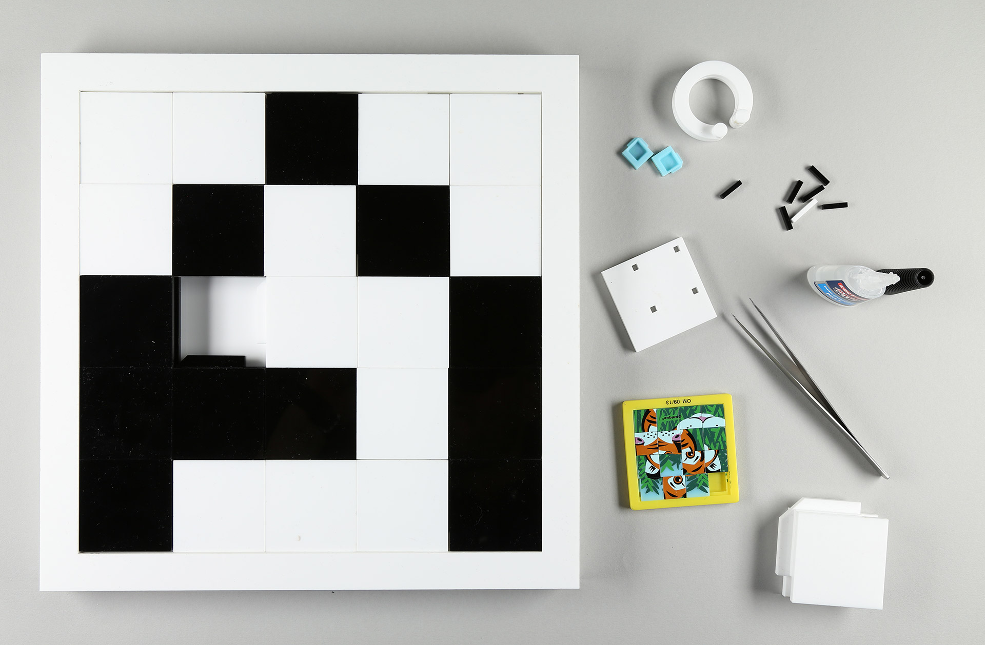
Prototype haptic design interface, sample 15-puzzle and development work.
The system
The system is based upon sliding puzzle games, often referred to as 8-puzzles or 15-puzzles, in which numbered or pictured square tiles can be reordered by making sliding moves that use one empty space within the puzzle.
The system exploits two characteristics of bitmap and modular typefaces:
- A 5 by 5 grid is the most economic and flexible modular system for drawing each letter of the Roman alphabet. This grid is determined by the need for 3 vertical downstrokes and 2 intervening white spaces for letters such as W or M, and 3 horizontal cross strokes and 2 intervening white spaces for letters such as S or B. A width of 5 units also offers a central downstroke axis for symmetrical letters such as T.
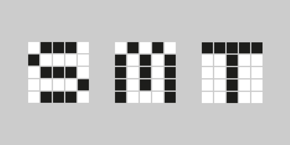
Standard bitmap letters S, M and T drawn on a 5 by 5 grid.
- Each letter of the Roman alphabet can be drawn using exactly 11 postive squares on a 5 by 5 grid. This figure of 11 is the result of experimentation to determine whether each letter of the alphabet could be formed from exactly the same number of squares, and if so, what the optimum and most flexible number would be.
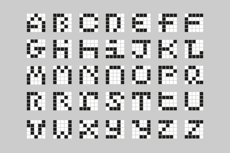
A possible A to Z of bitmap letters designed with just 11 postive squares.
There are some typographic compromises with this modular grid system. The 5 by 5 grid is less flexible than a more traditional bitmap grid ratio that would likely have 5 horizontal units and 7 vertical units in order to accommodate a different x-height and cap-height for both lower and upper case letters. However upper and lower styles can still be made for most letters using the 5 by 5 grid (see image above). The fixed number of 11 black squares (or positive units) to make each letter of the alphabet is restrictive. Sometimes a few more or a few less are needed to make standard letter forms. However, through initial drawings (see images below) 11 appeared to be the best compromise and offer the most flexibility for the most letters.
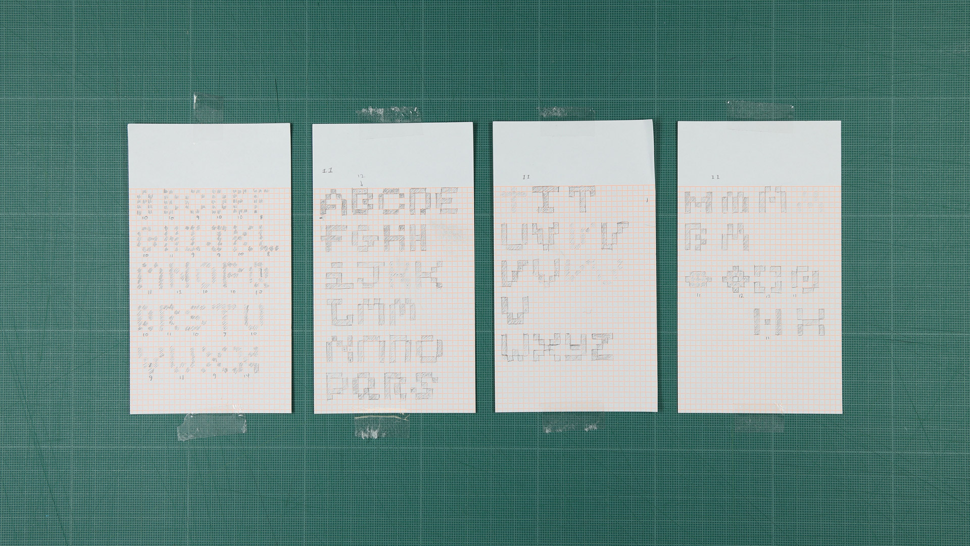
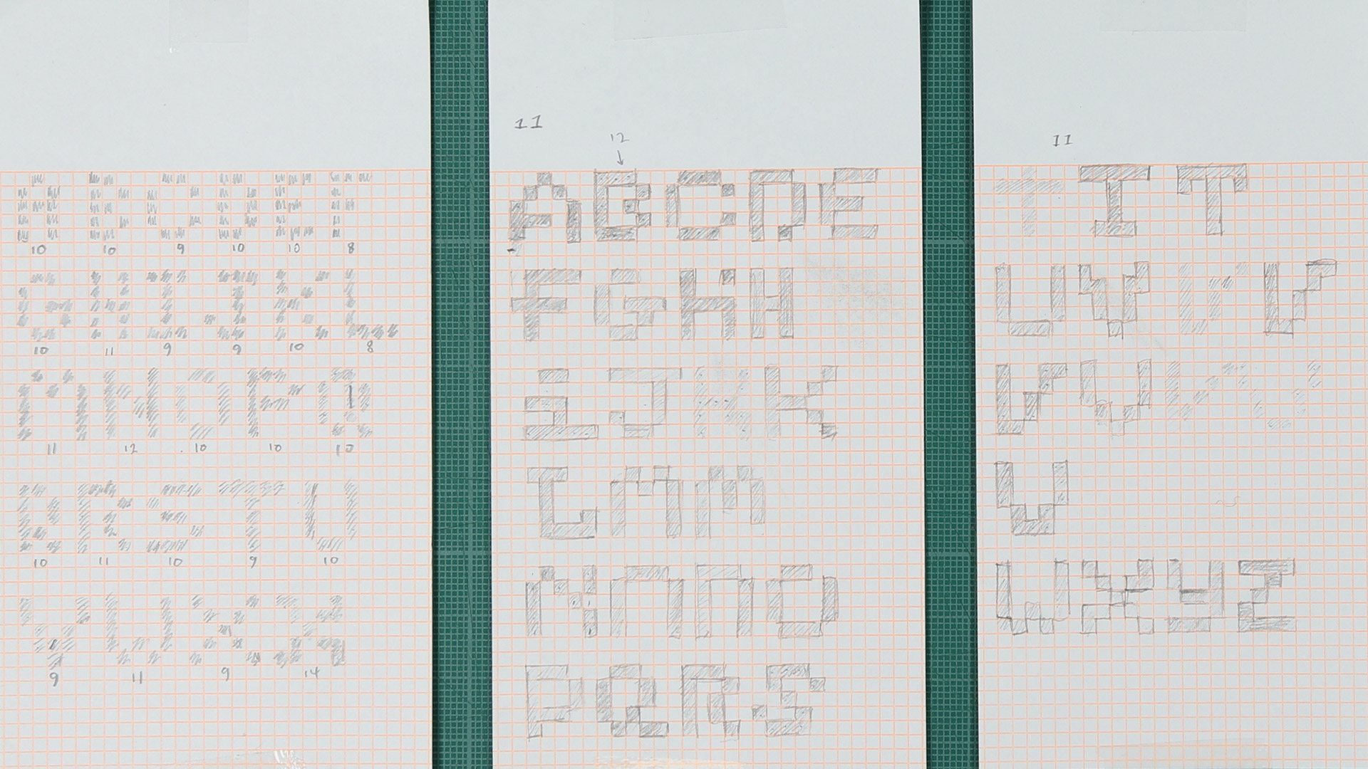
Initial sketches exploring whether a bitmap A to Z could be made from the same number of positive squares.
It was apparent that such a system could be ”played”. In other words people could be challenged to reorder the squares to make particular letters or they could use it exploratively to make their own new forms. Crucially the process of playing with the system could produce animated sequences of letters forming if the play was captured in some way.
Project outcomes
To test this premise the system was developed into an interactive installation for the Type Motion exhibition at FACT (the Foundation for Art and Creative Technology) in Liverpool in January2015. See the Exhibition section for more details.
An animated typeface and a basic Opentype font was produced as a result of the exhibition. To see the results and download the font go to the Typeface section.
Subsequently a hand held "toy" version has been developed. There are a few prototypes available to buy and plans and instructions for how to make your own in the Buy / Make Your Own section.
There are plans to develop an App version of the system, which will challenge people to design and submit their own letter form designs for inclusion into an Opentype typeface family, extending the system to a variety of modulor grid formations.
Context
This project references and builds upon a number of previous research projects by Ian Mitchell:
Life of Type animated typeface published online and exhibited at re_Type exhibition, Liverpool (2013)
Letterformer exhibited at FACT and Moderna Museet, Stockholm (2004)
Chinese Whispers collaborative typeface design project (2000)
Squarepusher interactive touch screen toy exhibited at Static Gallery Liverpool (1999)
Ian Mitchell
Ian Mitchell is Graphic Design and Illustration Programme Leader at Liverpool School of Art and Design, Liverpool John Moores University. He is an occasional contributor to the typography and graphic design collective, Beaufonts.
i (dot) mitchell (at) ljmu (dot) ac (dot) uk